

How To Create The Perfect Substack Homepage To Build Trust From Day One
3 principles, 3 steps, and 5 successful templates to copy


Howdy, Wealth Writers🤠

Every time someone clicks through your profile or stumbles across one of your articles, they most likely end up on your publication homepage.
99% of Substack Newbies have never actually looked at that page from a visitor’s perspective, and what they’d see is an untouched default template that looks identical to 10,000 other Substacks.
Every day the homepage looks generic and unintentional is a day you’re handing potential subscribers a good reason to leave.
Your homepage isn’t just where your articles live, it’s where strangers decide if you are worth subscribing to or not.
So today Vinayak Ramesh and me make sure your homepage is set up to convert those scattered visitors into loyal fans of yours. :)
What you’ll learn in this article:
✓ The one job your homepage has
✓ The 3 principles of a “good” homepage
✓ The 3 steps to create your perfect homepage
✓ 5 homepage templates of successful creators — yours to copy
Let’s goo! 🤠

Your Homepage’s Job
Before we get into the settings, let’s clear something up, cause most Substack Newbies confuse two different pages.
Your welcome page is what a brand new visitor sees the very first time they find your Substack.
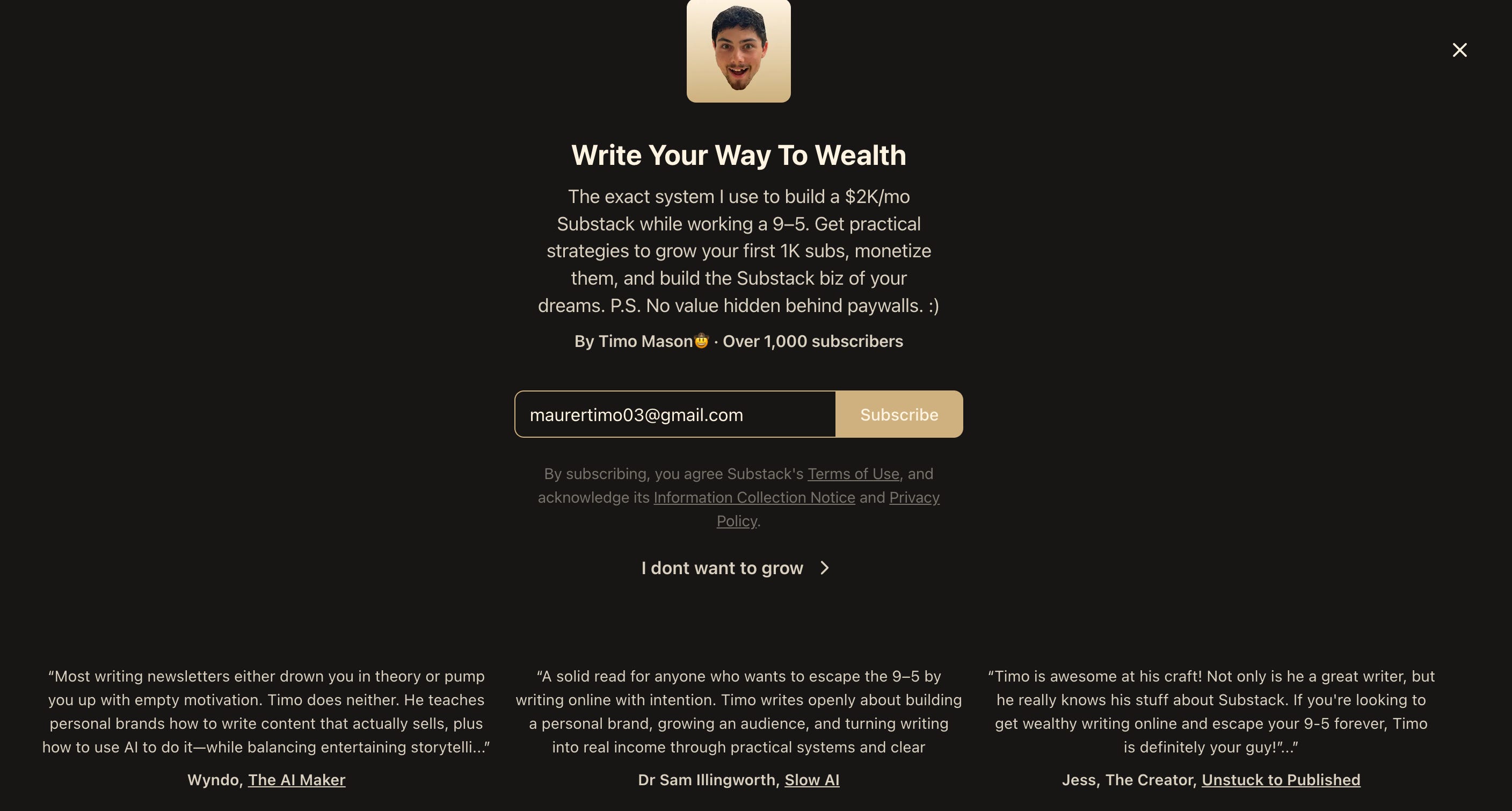
It’s your first impression, and what comes right before the homepage.
Jess, The Creator and I already wrote the full guide on nailing your welcome page here.
Your homepage is everything that comes after the welcome page and is like your publication’s “home base”.👇
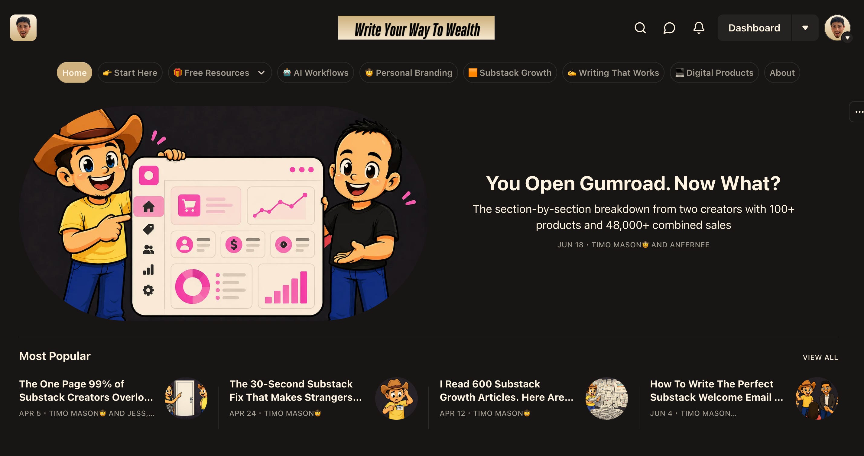
A good homepage does 2 tasks:
Brings any visitor (random scroller or loyal subscriber) deeper into your content ecosystem
Turns a curious person into a Subscriber
Nailing these tasks comes down to three principles, and every setting we’ll cover today maps back to them.
Principle 1: Look Intentional
A homepage that looks like a default template signals that nobody cares about this publication. A homepage with a real logo, consistent colors, and a branded layout signals you know your stuff. :)
Principle 2: Stay On Brand
Your homepage doesn’t live in isolation. It should feel like the same world as your welcome page and your Substack profile. Inconsistency breaks trust.
Principle 3: Make Exploration Easy
Once a visitor likes what they see, they need a clear path into your content. If it takes more than two seconds to figure out where to go next, people won’t bother.
Now let’s build it, top to bottom. :D
3-Steps To Your Perfect Homepage
Step 1: Your Navigation Bar
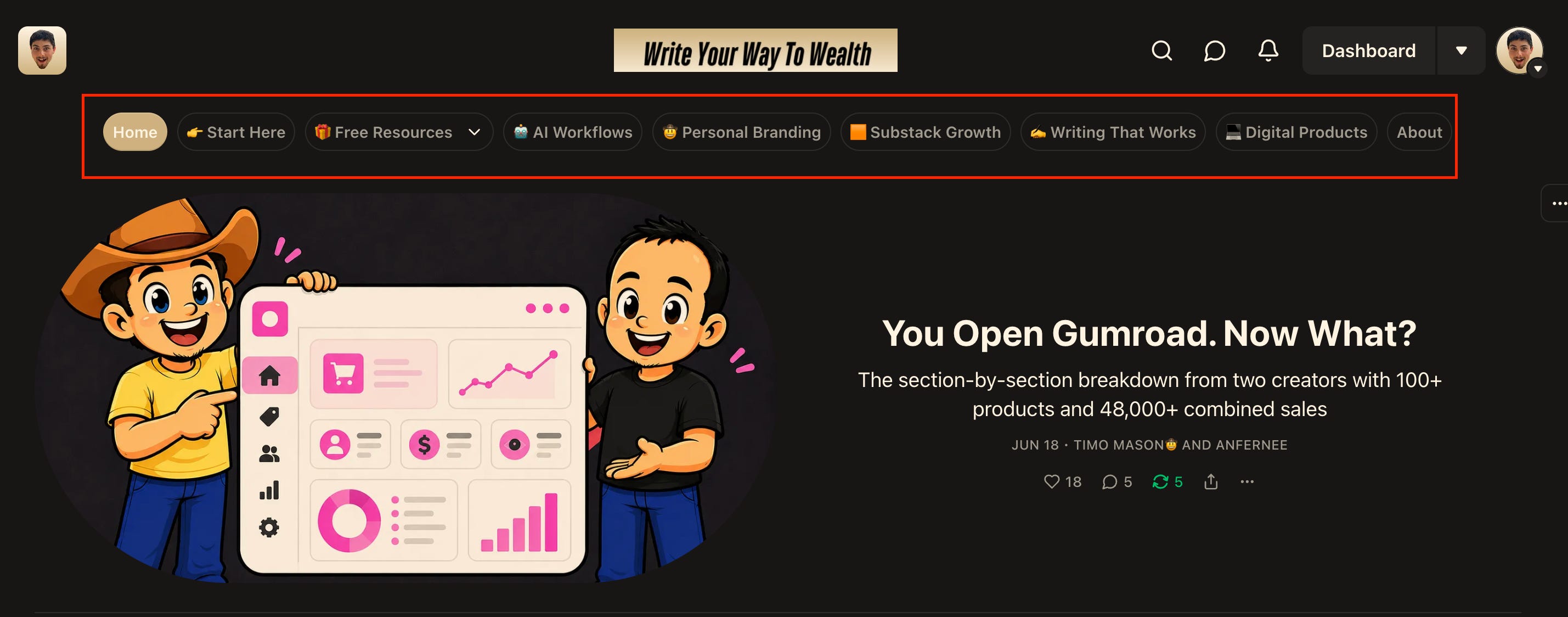
To edit your navigation bar you have to go Dashboard → Settings → Website
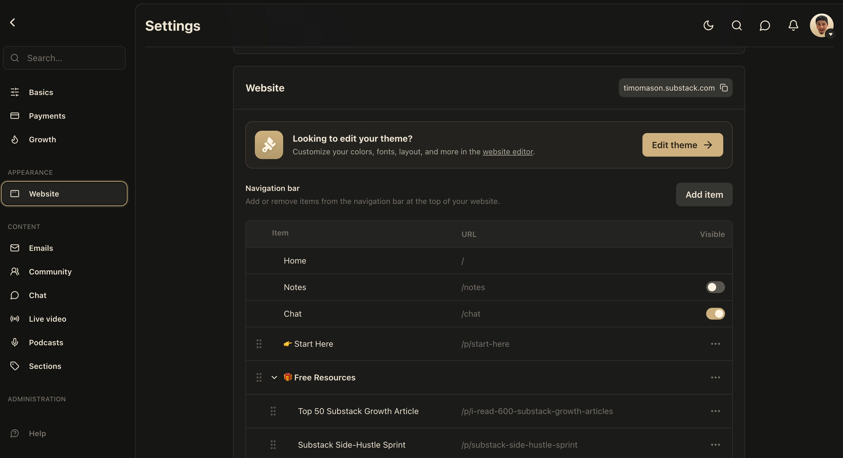
The default pages are Home, Notes, Chat, Archive, Leaderboard, and About.
I have all except Home and About disabled.
Notes are already fully scrollable and available on your profile, so if anybody wants to read through all your notes your profile is the place.
Chat (which is the subscriber community chat) is easily and more intuitively accessible over the Substack DM’s, no need to show it on your home page.
Archive is the default way people can look through your content and sort it by “top” or “latest” articles, but there’s a smart way to introduce people to your content system and I show you in just a second. :)
Leaderboard shows which referrals brought in how many subscribers, and this info is just not relevant for 99% of homepage visitors.
Replace Archive With Content Bucket Pages
The default Archive shows visitors to one giant chronological dump of every article you’ve ever written, with no real organization, context, or clear path to what they actually care about.
A smarter approach is to replace this Archive with individual pages for each of your content buckets.
Think about it from your reader’s perspective…
Someone who found you through a note about AI workflows probably doesn’t care about your mindset articles right now.
If your navigation bar has a specific “AI-Workflows” page they can click straight into, they stay engaged with exactly the content that hooked them in the first place.
That’s the difference between a reader who browses one article and a reader who spends twenty minutes going through your content ecosystem.
How To Set Up The Content Bucket Pages
Action 1: Create a tag for each content bucket
Use this prompt to come up with specific tags/content buckets:
“Help me plan the navigation bar for my Substack homepage. Here are the details: My newsletter is about [topic]. My readers come to me for [list 2-3 specific things they want].I currently publish [describe your content types or series]. Help me design a navigation bar that replaces the default Archive with contentbucket pages. Suggest 4-6 page names that each represent a specific reader intent or content category. Each page name should be short (1-3 words) and immediately clear about what’s inside. Don’t suggest generic pages like ‘Blog’ or ‘Posts’.Suggest pages that a specific type of reader would click because it’s exactly what they came for.”
Action 2: Tag all your existing articles
Go to every article in your dashboard, open the post settings, and find the Tags field. Add the tag of the content bucket matching the article’s topic.
It’s important to do this with every article cause the content bucket page (we will create) only pulls in articles that carry that tag.
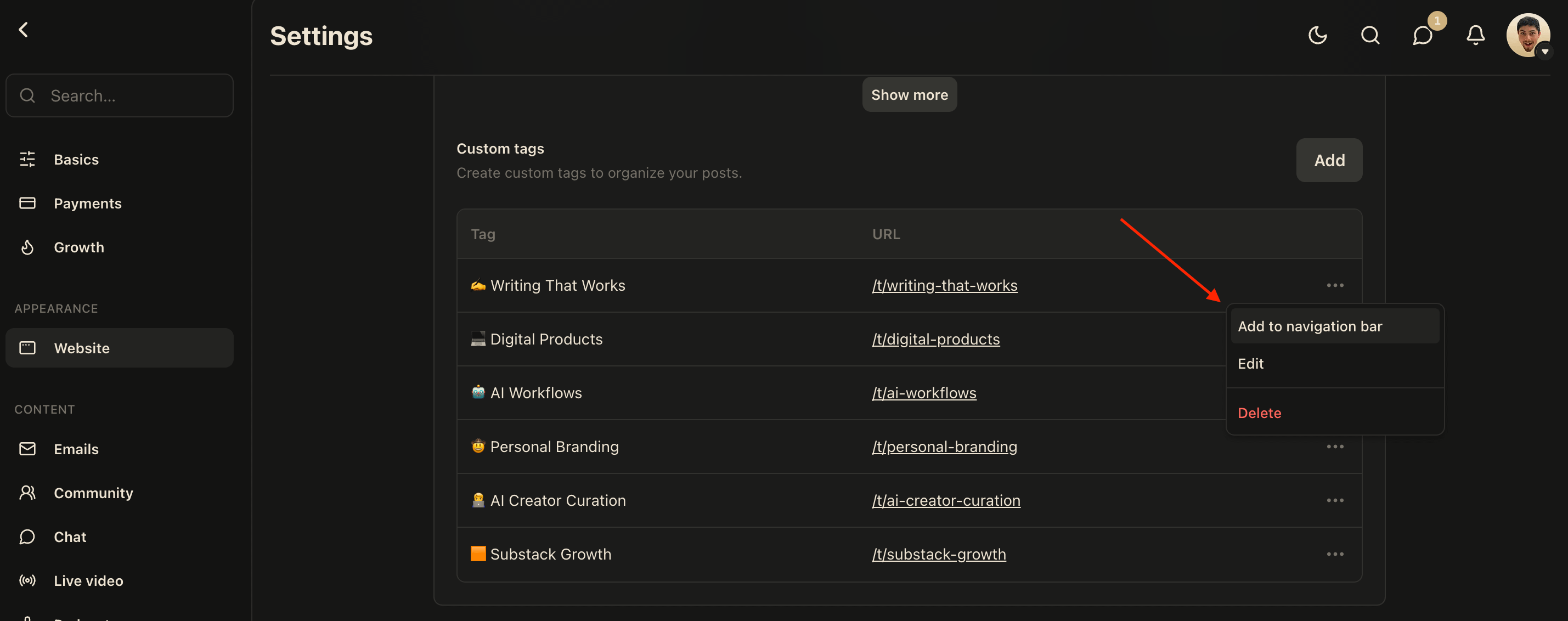
Action 3: Add each tag to your navigation bar
Go to Settings → Website → Navigation bar and you’ll see your tags ready to get added into your navigation bar. :D
Next 3 Pages To Build Over Time
The content bucket pages are your priority, but once those are set up, here are 3 more custom pages worth thinking about:
1 . Start Here Page
It’s an introduction to who you are, what you cover, how it’s all set up, so when a new visitor clicks it, they immediately understand the world they’ve landed in.
2. Free Resources page
If you have resources that go deeper than a regular article, like 5-day courses or big curations they deserve their own dedicated page instead of getting buried in your archive.
3. Why Upgrade page
This one is only relevant if you actively want to promote your paid tier. It’s a dedicated page that explains what your paid subscribers get and why the upgrade is worth it.
Step 2: Logo, Colors, and Font
This is where you turn your homepage from “a Substack” into your Substack. Everything in this step lives in Dashboard → (Scroll down on the left navigation bar) → Website Editor.
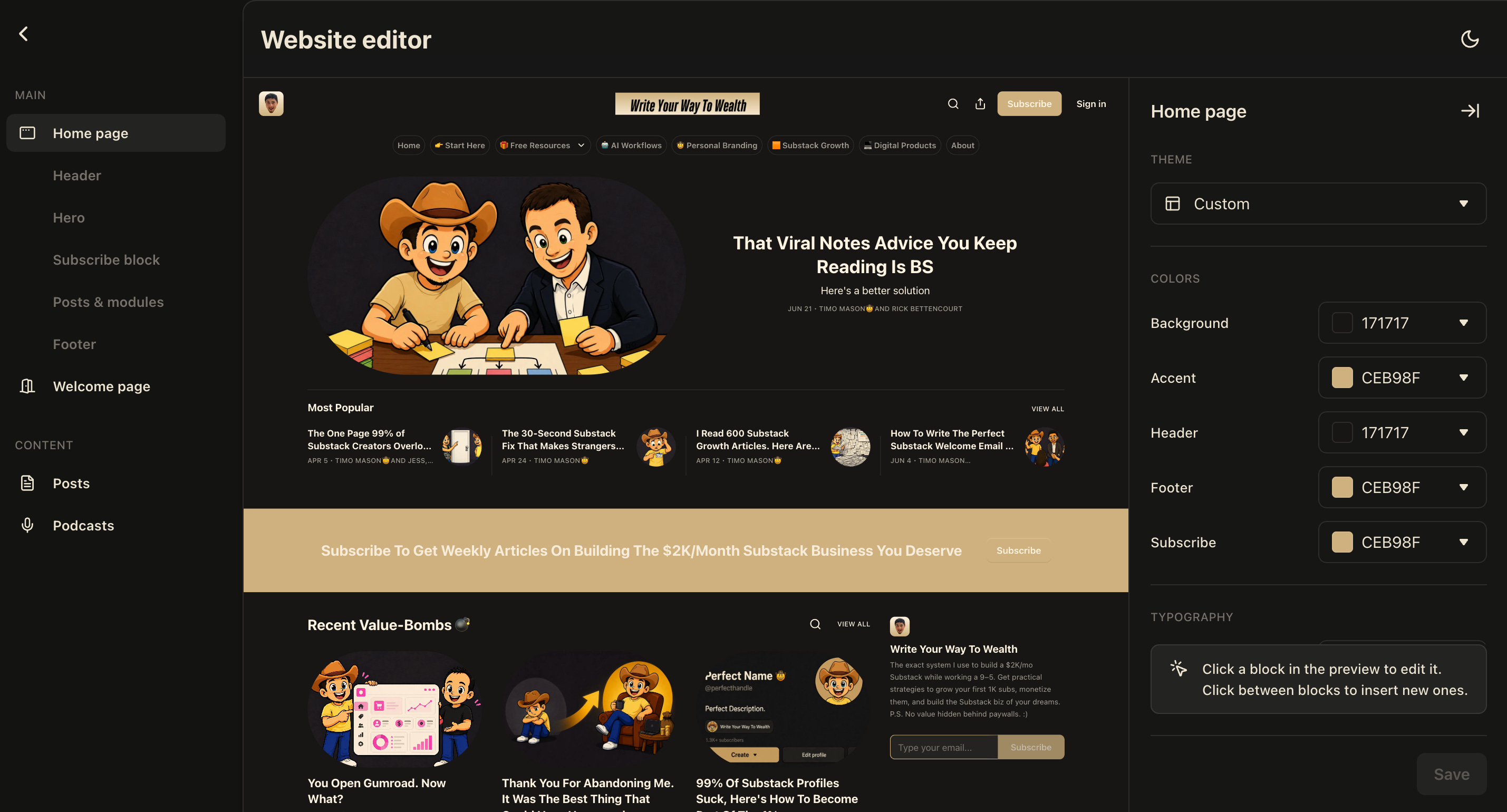
Now, this Website Editor is THE MOST overwhelming layout you will find in your whole Substack, but to make it as simple and straightforward we will rely on our principles (Look Intentional, Stay On Brand, Make Exploration Easy) to navigate this with ease. :)
P.S. I will not go through every single setting here, everything that I don’t mention, you can count as “Just set it up the way you prefer”. :)
Header: Logo and Wordmark
Inside the Website Editor, click on the Header section and the options will pop up on the right side. That’s where you set your logo and your wordmark.
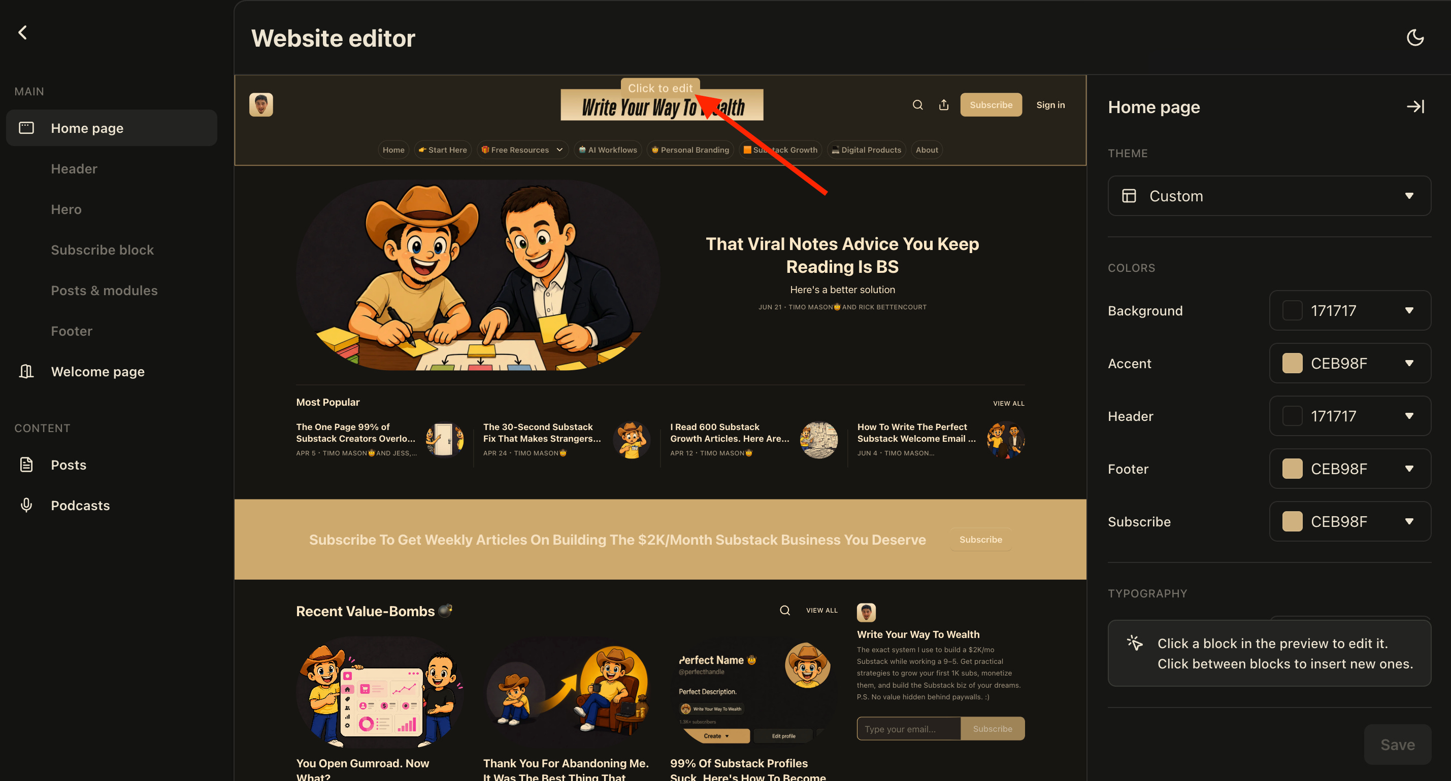
Logo
Honestly, you don’t need to overthink this one, I was lazy and just used my Substack profile picture, and it works perfectly fine. If you already have a profile picture that represents your brand, use that.
Wordmark
By default, Substack just shows your publication name in a basic font, and it looks like every other uncustomized Substack out there.
A custom wordmark with your branding colors makes your homepage look intentional and professional.
Jump into Canva and spend ten to fifteen minutes creating a wordmark with your branding colors, or use ChatGPT Image creation.
It’s not complicated, it’s a one-time task and the result is worth every minute.
Accent color
Your accent color controls buttons, pull quotes, and hyperlinks across your homepage and posts. Whatever color you use in your branding (wordmark, thumbnails, profile) that’s the color(s) that go here.
Don’t overcomplicate it. Substack gives you five color options to play with, but as you can see in the earlier screenshots, I just use my black and my gold contrasting each other. Two brand colors with clean contrast is all you need.
Font
When you scroll below the colors, you will find Typography, here Substack gives you a handful of font options.
Pick the one that matches your voice. A financial newsletter and a personal storytelling newsletter should feel different, and font is part of that signal.
One more thing before you move on…
While you're in the sidebar, scroll all the way down and you'll find an option called Use custom body layout.
Make sure you activate it cause this unlocks full control over your homepage and is what allows you to do everything we cover in the next steps.
Step 3: The Subscribe Block
Below the header is where the most important conversion element on your homepage lives:
The subscribe block.
The header itself (hero layout, how your posts are displayed) just personalize it however feels right to you, but right below it, you want a Subscribe block.
With the Subscribe block you can write a completely different message depending on who’s reading. Non-subscribers see your pitch, free subscribers see your upgrade message, and paid subscribers see a thank-you.
How to add it:
Make sure you’re in the Website Editor with custom body layout activated, then click Click to add block in the layout and choose Subscribe block.
Here’s what my texts look like, use it for inspiration:
Non-subscribers:
“Subscribe To Get Weekly Articles On Building The $2K/Month Substack Business You Deserve”
Free subscribers:
“My content is always 100% free. Upgrade if you want to support my free-content approach.”
Paid subscribers:
“Thank you for being a paid subscriber. :D”
Now you know every website feature that REALLY matters. :)
Vinayak shows you in the next section how different creators have put them into action.
5 Real Substack Homepages, Decoded (Vinayak)
Timo just showed you every lever in your Substack dashboard. You know what each setting does and how to configure it.
Now I want to show you what happens when people actually use those settings well.
I went through the homepages of five newsletters that have built massive audiences on Substack. I spent time with each one, looking at it the way a total stranger would.
Not at the settings behind the page, but at the finished product. What it looks like. What it signals. What it makes you feel before you’ve read a single article.
Here’s what I found, and what you can steal from each one (ethically!).
1. Lenny’s Newsletter: The Warmth and the System
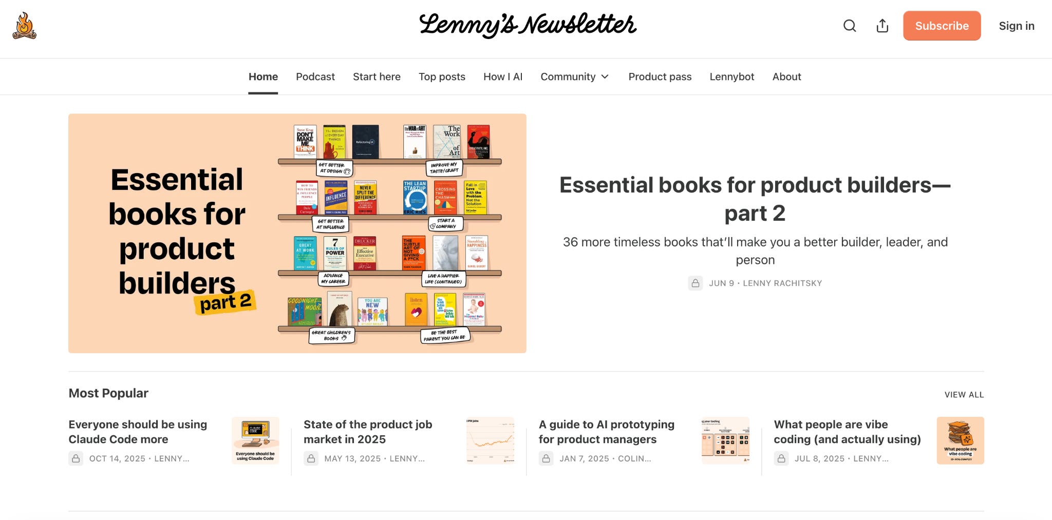
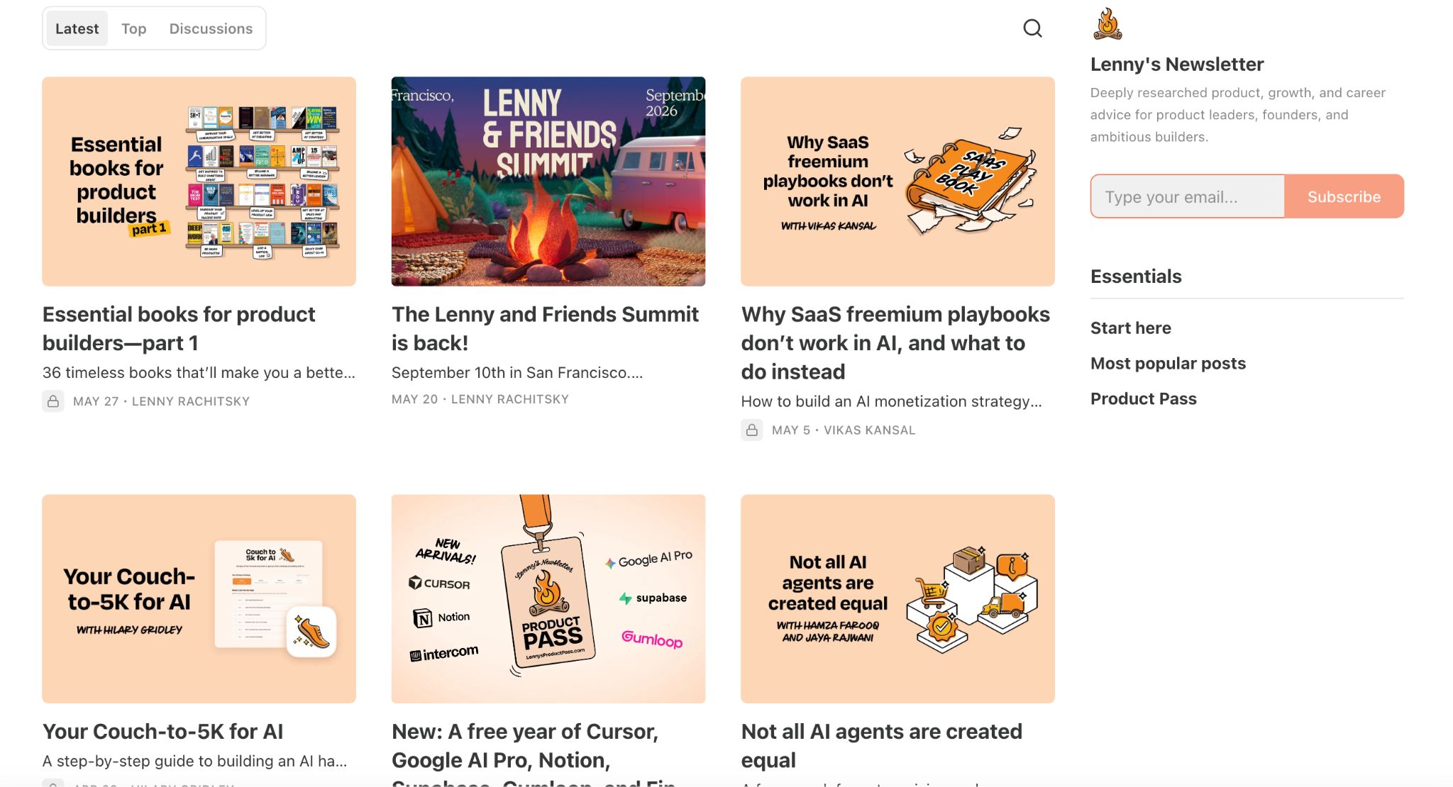
The first thing you notice about Lenny Rachitsky’s homepage is the campfire logo in the top left. Not a photograph of Lenny. Not a generic monogram. A hand-illustrated campfire, warm and friendly.
It’s doing something very specific: it’s making you feel like you’ve arrived somewhere cozy, somewhere people gather to share knowledge. That’s not an accident. That’s a branding decision that reinforces every article he writes.
Next to the logo, centered at the top: “Lenny’s Newsletter” in a custom handwritten script wordmark. It looks like something a person actually wrote, not a font selected from a dropdown. Again, warm. Personal. Approachable.
The color palette
Lenny runs an almost entirely white homepage with a single accent color: orange. Not multiple colors, not gradients. Just orange, used strategically on the Subscribe button in the top right corner.
This is a classic high-contrast CTA technique. When your page is white and the only colored element is the Subscribe button, every visitor’s eye is pulled toward it even if they don’t consciously notice. There’s no visual competition. The button wins by default.
The navigation bar
Lenny’s navigation bar is one of the best examples of exactly what Timo described when he talked about replacing the default Archive with content bucket pages.
Look at what’s in his nav: Home, Podcast, Start here, Top posts, How I AI, Community, Product pass, Lennybot, About.
Every single one of those is a destination built for a specific reader intent. Someone who wants to dive into AI tools goes straight to How I AI. Someone who just found Lenny and wants to understand the publication goes to Start here.
Someone who wants to hear him talk goes to Podcast. The navigation is a reader experience map, not a list of Substack default pages.
The regular Archive link is nowhere to be seen. Instead, readers get multiple curated entry points that each serve a different reason for being on the page.
The hero section
Lenny uses the Feature layout: one large, prominently displayed article dominates above the fold, with the thumbnail on the left and the title, subtitle, and author name on the right.
The thumbnails he uses are custom illustrated, warm-toned with a distinctive peach and orange palette. They’re immediately recognizable as “a Lenny article” even before you read the title.
Below the hero, there’s a “Most Popular” section showing four articles. This is smart. It’s social proof in content form. These aren’t just recent articles. They’re the articles that proved themselves. Putting them right below the hero says to a new visitor: if you’re not sure where to start, these are the ones people came back to.
The sidebar (below the fold)
On the archive view, the right sidebar has an “Essentials” section with direct links to Start here, Most popular posts, and Product Pass. This sidebar functions as a second navigation for readers who are exploring. It removes the need to hunt through a chronological list to find entry points.
STEAL THIS
Pick one accent color and use it only on your Subscribe button. Everything else on your homepage can be black, white, and gray.
The more isolated your Subscribe button color is, the more your eye goes to it automatically. Build a “Start here” page and add it to your navigation bar today. This is the single highest-leverage thing you can do for a new visitor.
2. Dan Koe — future/proof: The Complete Dark World
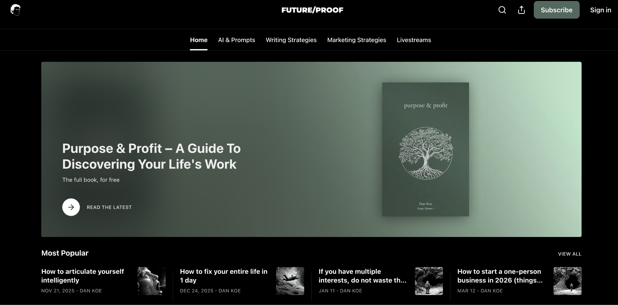
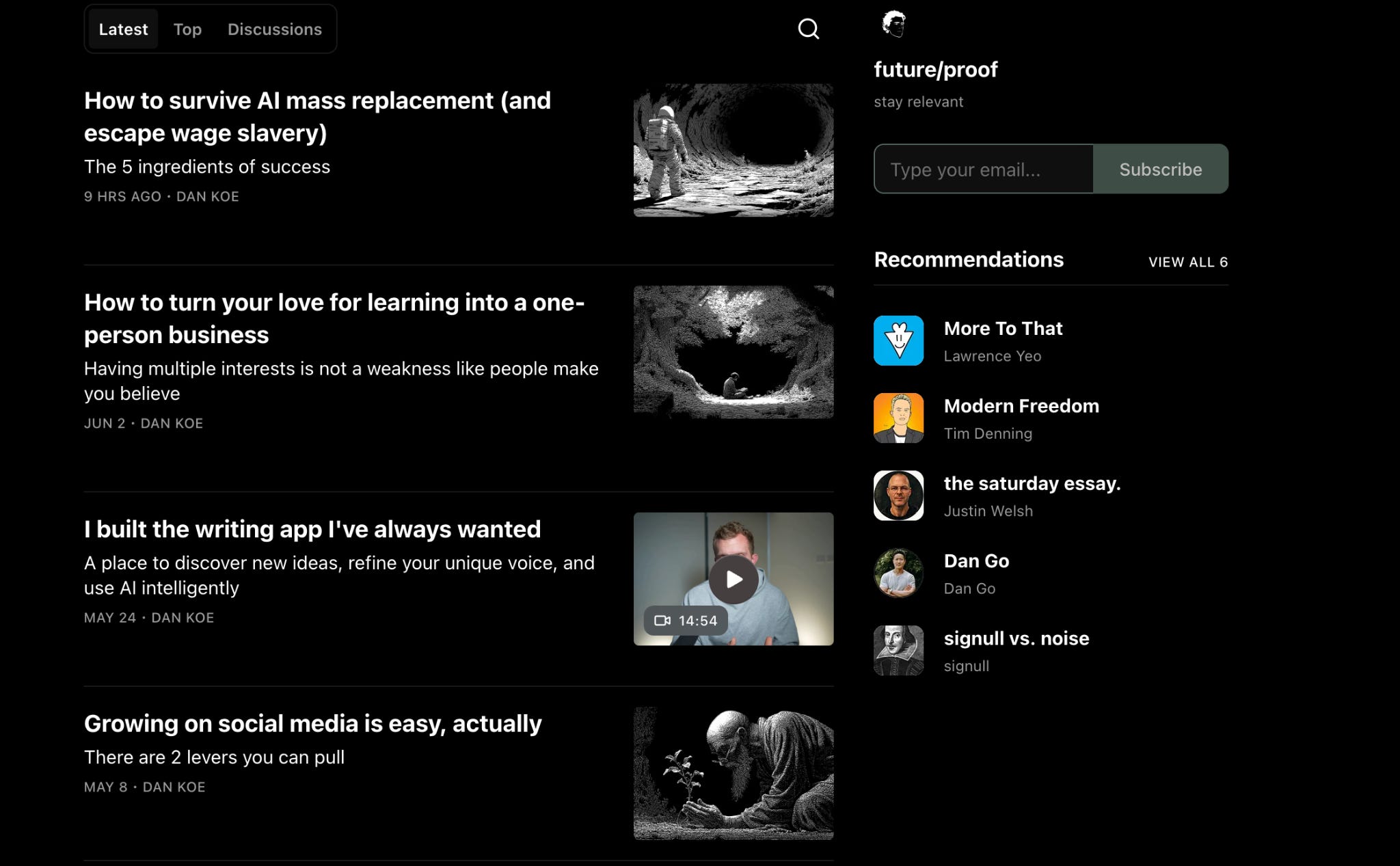
DAN KOE’s homepage is a commitment. The background is black all the way to the bottom. Not just a dark header that transitions to white. Every element on the page, the navigation, the article cards, the sidebar, everything lives on that black canvas.
This is a design philosophy, not just an aesthetic choice.
What the black background is doing
In color psychology, dark interfaces signal a category: premium, considered, exclusive. Think of the most deliberate brands you know. High-end audio equipment, luxury watches, professional creative tools.
They almost all use dark backgrounds. The message is: this is for people who are serious, who have taste, who know what they’re looking for.
Dan Koe writes about building a one-person business through philosophy and intentional thinking. His audience isn’t looking for quick tips. They’re looking for a perspective that matches a worldview they already hold.
The all-black homepage is a filter. It attracts exactly the people it’s meant to attract, and signals to everyone else that this might not be for them.
The wordmark and logo
At the top center: “FUTURE/PROOF” in clean white all-caps sans-serif. Not a custom script. Not an illustrated logo. Just strong typography. The text is the brand. This works because Dan’s entire identity is built on intellectual authority and direct communication. A flowery logo would contradict that.
His small circular avatar sits in the top left corner. It’s understated, but it’s there. There’s a human behind this publication.
The Subscribe button: intentionally muted
The Subscribe button in the top right is gray. Not orange, not a bright color. Gray. On a black background.
This is a deliberate psychological move. There’s a concept called reactance: the more pressure you feel to do something, the more you resist it. Dan’s audience is drawn to autonomy and philosophy.
An aggressive, bright-orange Subscribe button would feel like a sales pitch and would likely push exactly the people he wants to attract away from the page.
The gray button says: it’s here when you’re ready. It’s not demanding anything.
The navigation: functional content buckets
Dan’s nav bar shows: Home, AI & Prompts, Writing Strategies, Marketing Strategies, Livestreams.
Four content bucket pages, each one mapping to a specific reader interest. No Archive, no generic pages. Someone who found Dan through AI content goes straight to AI & Prompts.
Someone interested in growing their writing career goes to Writing Strategies. The nav bar does the sorting for the reader before they have to do it themselves.
The hero: the book giveaway
This is the most surprising and most clever thing on Dan Koe’s homepage. The hero section doesn’t show his latest article. It shows a pinned post offering his book “Purpose & Profit: A Guide To Discovering Your Life’s Work” for free.
Think about that conversion decision. The most valuable real estate on his entire homepage isn’t being used to show the latest content. It’s being used to give away something meaningful to every visitor who arrives. The subtext under the book title says: “The full book, for free.”
This does two things. It immediately communicates the depth and seriousness of his work. And it creates an incredibly low-friction first step for a new visitor: don’t subscribe yet, just get a free book. By the time they’ve read the book, they’re sold on subscribing.
The article thumbnails
Below the hero, the article cards use dark, moody, cinematic photography: solitary figures, tunnels, caves, exploratory imagery. They match the black background perfectly and reinforce the same emotional register: thoughtful, deep, independent.
This visual consistency across thumbnails is a brand choice most small newsletters don’t think about. Every article image on Dan Koe’s homepage looks like it belongs to the same world.
STEAL THIS
Pin your best piece of content, not your most recent one, to the hero position. Especially if you have something you’d call your “entry point” article or a free resource you give away.
The hero spot should serve a new visitor first. Make your article thumbnails visually consistent. They don’t all have to be identical, but they should feel like they belong to the same publication.
3. Justin Welsh — the saturday essay: Brand Consistency at Scale
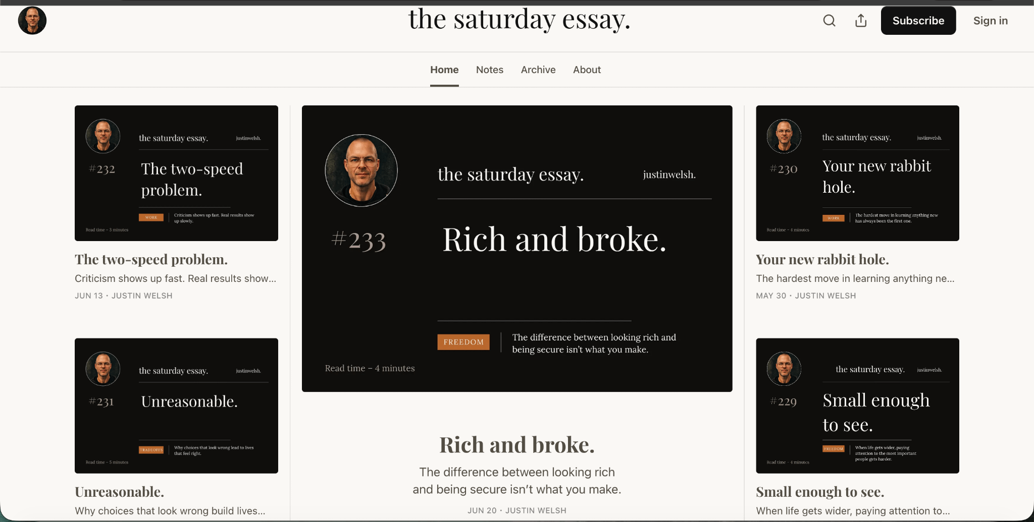
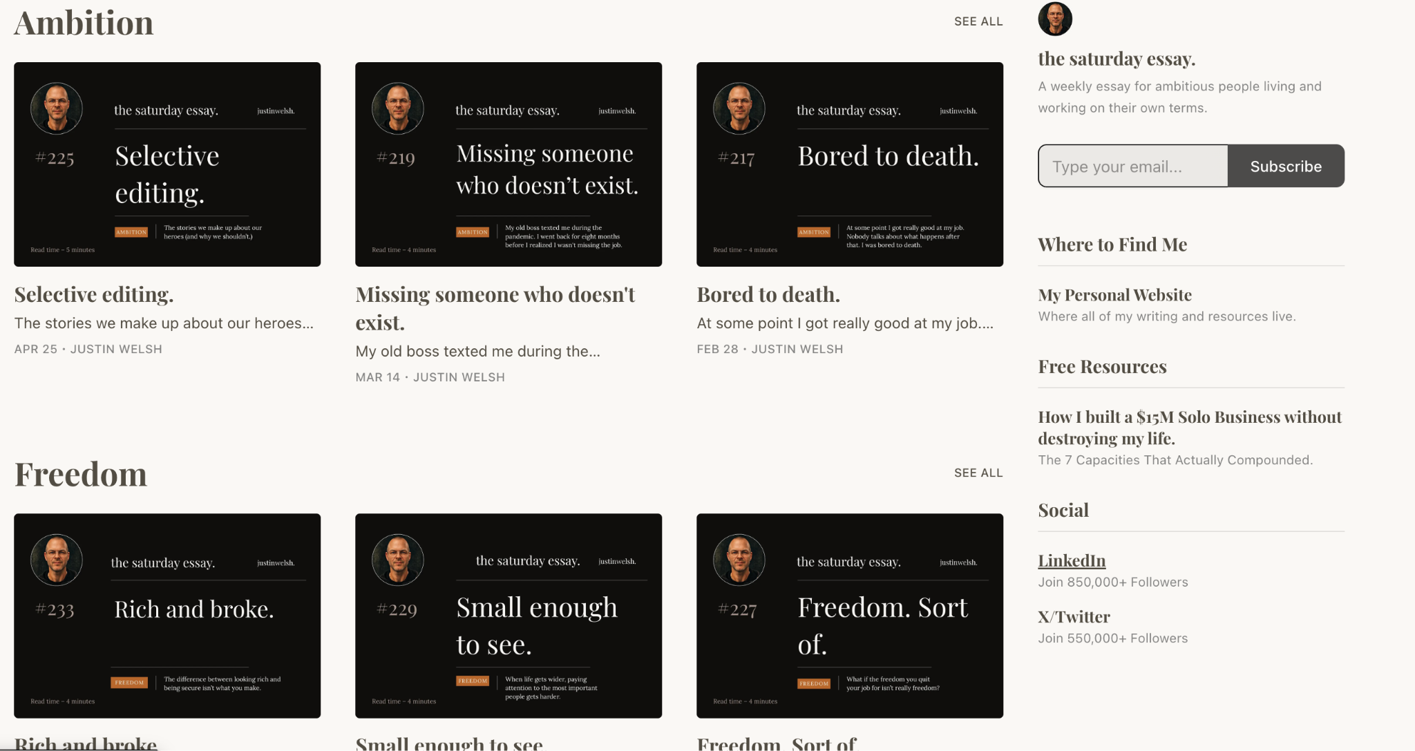
Justin Welsh’s homepage is immediately distinctive, and it does something none of the others on this list do: every piece of content on the page is also a brand unit.
The visual identity
White/cream background. Black Subscribe button. The wordmark is “the saturday essay.” in a lowercase serif font, centered at the top. The period at the end of “the saturday essay.” is intentional. It’s a punctuation mark that makes the name look like a complete thought, a statement, not just a label.
The navigation is stripped to its minimum: Home, Notes, Archive, About. Four items. No content bucket pages in the nav bar. Justin took a different approach to reader navigation: layout-based organization instead of navigation-based.
The magazine grid layout and why every card is the brand
The hero on Justin’s homepage is a 5-card magazine grid. A large center card flanked by two smaller cards on each side. But what makes this layout remarkable isn’t the grid itself. It’s what each card looks like.
Every single article card uses the same branded template: black background, his face photo in a circle in the top left, “the saturday essay.” in white text, his Twitter handle in the top right, the issue number in the left margin, the article title in large white text, and a small colored category label at the bottom in orange.
These cards are not generated by Substack automatically. Justin designed a card template and created a custom thumbnail for every article. What this does is create a situation where every article on his homepage functions as a standalone advertisement for the newsletter.
When someone screenshots one of these cards and shares it on Twitter or LinkedIn, the brand is baked into the image. The newsletter markets itself through its thumbnails.
Content organization below the fold
Scroll down on Justin’s homepage and you see how he handles content buckets without using the navigation bar for it. Instead of nav links, he has horizontal sections: “Ambition” , “Freedom”, each one showing a grid of three article cards.
This is a layout-based content organization instead of a navigation-based one. The reader doesn’t have to leave the homepage to find content that interests them. It’s all right there, organized by theme.
The sidebar: social proof that earns trust
The right sidebar on Justin’s homepage is a trust-building machine. It has his photo, a short description of the newsletter, and a subscribe form. Then: LinkedIn (850,000+ followers), X/Twitter (550,000+ followers).
Those follower counts aren’t there to show off. They’re there to answer the visitor’s unspoken question: who is this person and why should I trust them? When a stranger sees 850,000 LinkedIn followers, they don’t need to evaluate the content to decide whether to take this person seriously. The crowd already did that for them.
STEAL THIS
Design a branded article card template in Canva and use it for every post thumbnail. It takes about 20 minutes to set up a template you can reuse. What you get in return is a homepage that looks like a real publication and content that carries your brand every time it gets shared.
Use content sections below the fold to organize by topic instead of sending readers to a separate page. Pick two or three themes, build sections for them, and let visitors self-sort on the homepage itself.
4. Tim Denning — Modern Freedom: The Pinned Welcome Post Technique
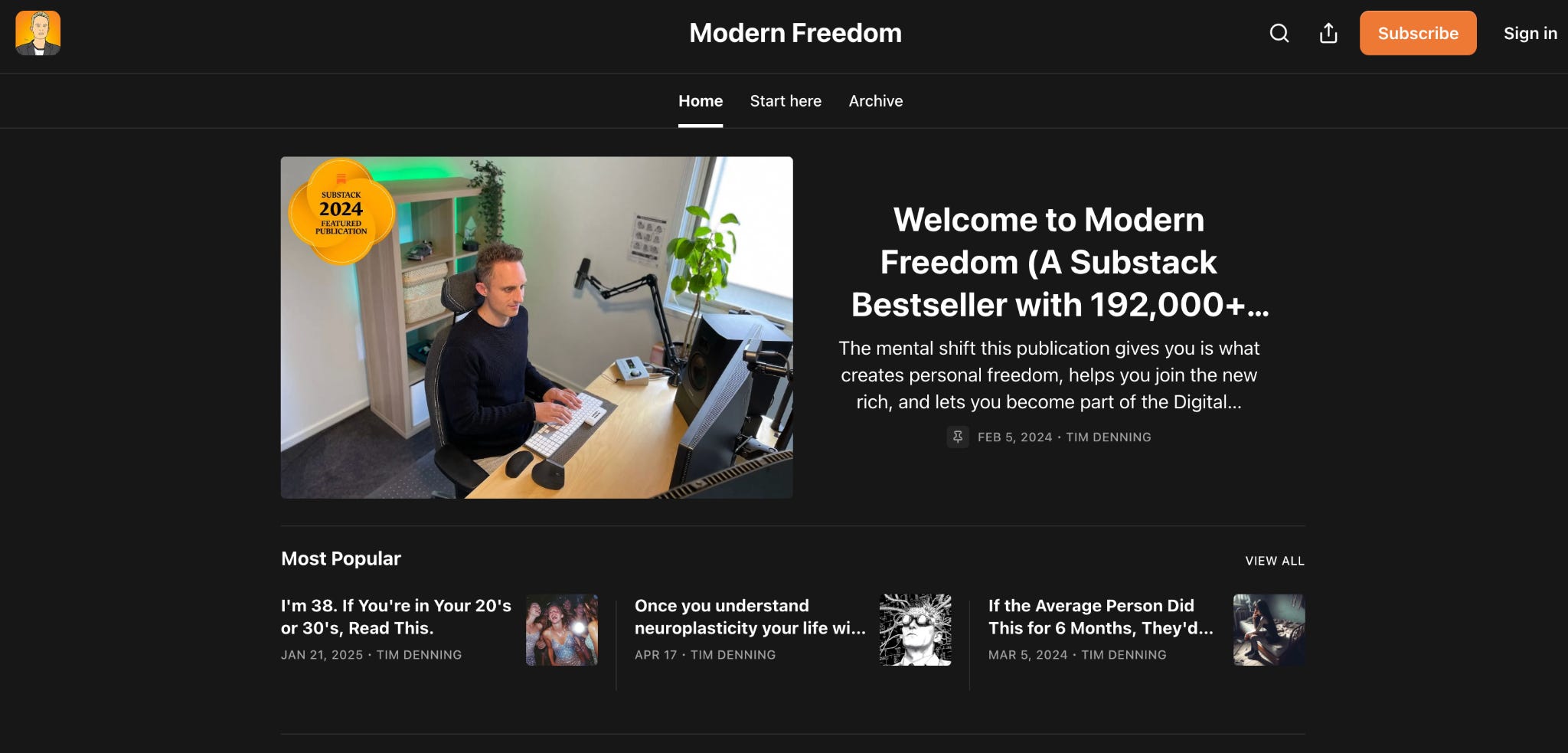
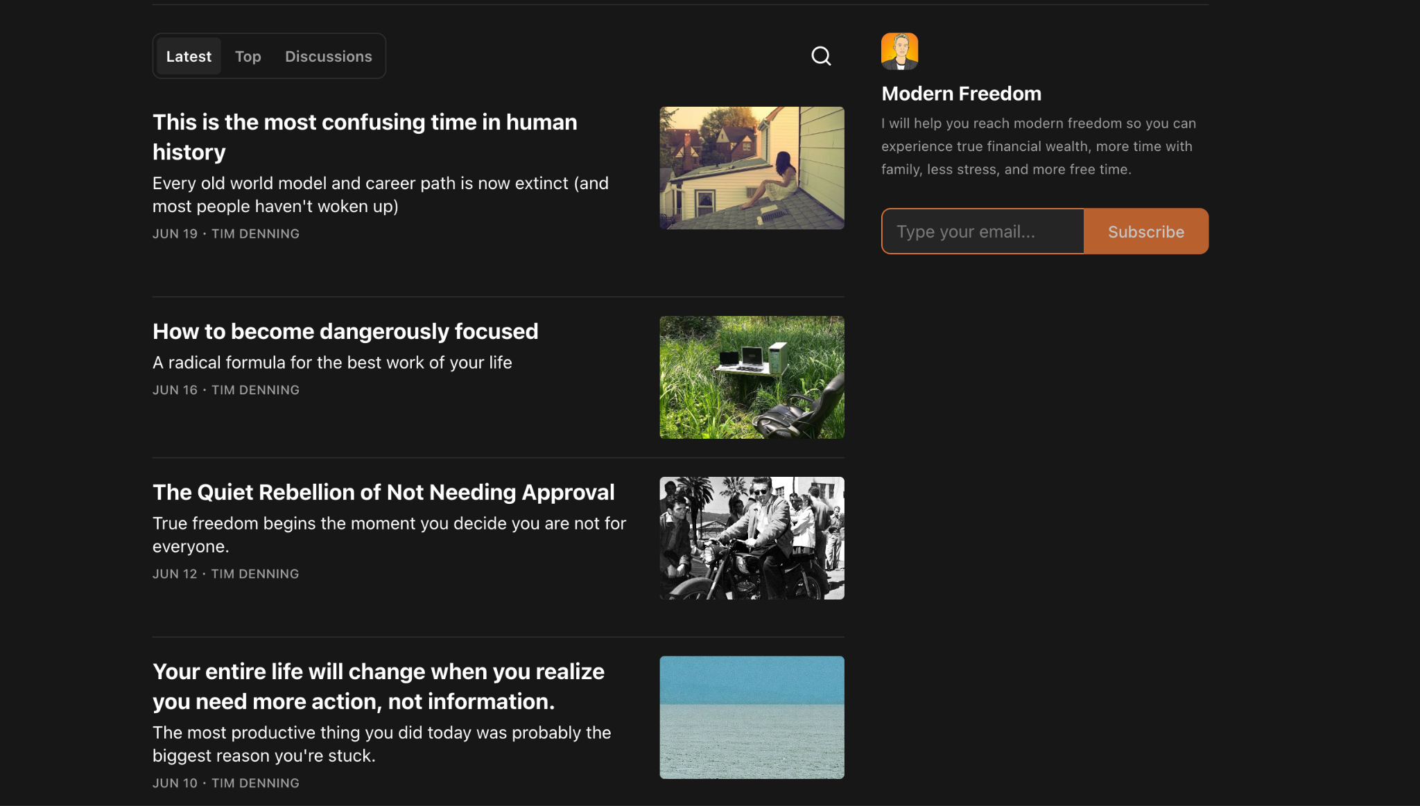
Tim Denning’s homepage (called “Modern Freedom”) does something I haven’t seen any of the other creators do, and it’s one of the smartest conversion decisions on this entire list.
The visual identity
Dark near-black background, same category signal as Dan Koe: this is a premium, serious publication. The logo in the top left isn’t a photo or a wordmark. It’s an illustrated cartoon avatar of Tim. Warm, personable, slightly quirky. It introduces a bit of human personality into an otherwise dark and serious-looking page.
“Modern Freedom” in clean, bold white sans-serif, centered at the top. Below it, a minimal navigation: Home, Start here, Archive. Three items. That’s it.
The Subscribe button: orange on dark
Tim uses an orange Subscribe button in the top right. On a dark background, orange has even higher contrast than it would on white. Your eye goes there immediately. Unlike Dan Koe’s muted gray button, Tim makes no apologies about asking for the subscribe.
This is a deliberate difference from Dan Koe’s approach. Tim publishes multiple times a week. He’s playing a volume and frequency game. He wants people to subscribe quickly. An aggressive button matches that strategy.
The pinned welcome post: the conversion genius
Now here’s the most important thing on Tim’s homepage.
The hero position is occupied not by his latest article, but by a pinned post titled: “Welcome to Modern Freedom (A Substack Bestseller with 192,000+...)”
The thumbnail for this post shows Tim sitting at his desk working, looking real and approachable. And there’s a gold badge on the image that says “Substack 2024 Featured Publication.”
Think about what this hero post is doing for a new visitor. It’s an evergreen introduction to the newsletter that never gets bumped down by newer content.
Every new visitor who lands on the homepage sees the same thing: a welcome, a credential (Substack Bestseller, 192,000+ subscribers), and a face. It’s a conversion-first hero rather than a recency-first hero.
Most Substacks show their latest article in the hero position. This means new visitors might land on a post from a series they don’t know, or something that assumes existing reader knowledge. Tim’s approach ensures every new visitor gets the same designed first impression.
The sidebar
The right sidebar has his illustrated avatar, “Modern Freedom,” and one sentence: “I will help you reach modern freedom so you can experience true financial wealth, more time with family, less stress, and more free time.” Then the subscribe form.
That one sentence is worth studying. It’s a pure outcome statement. It says specifically what the reader will be able to do after subscribing. It answers “what’s in it for me?” in one sentence.
STEAL THIS
Create a pinned “Welcome” or “Start here” post and set it as your hero. Write it as if you’re introducing yourself to someone who has never heard of you: who you are, what the newsletter covers, what a reader can expect, and why it’s worth subscribing.
This one post becomes your homepage’s most important conversion asset.Study Tim’s sidebar sentence. Then write your own version: “I will help you [specific outcome] so you can [benefit 1], [benefit 2], and [benefit 3].”
5. The Profile: The Magazine That Earns Its Subscribe
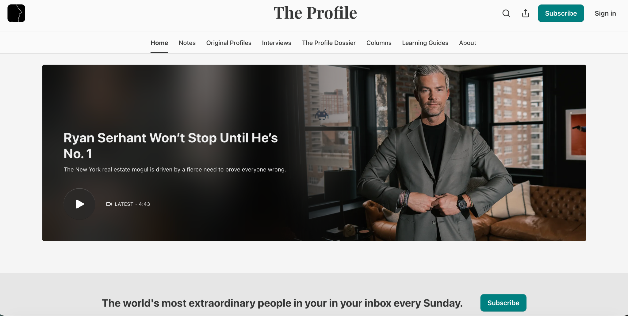
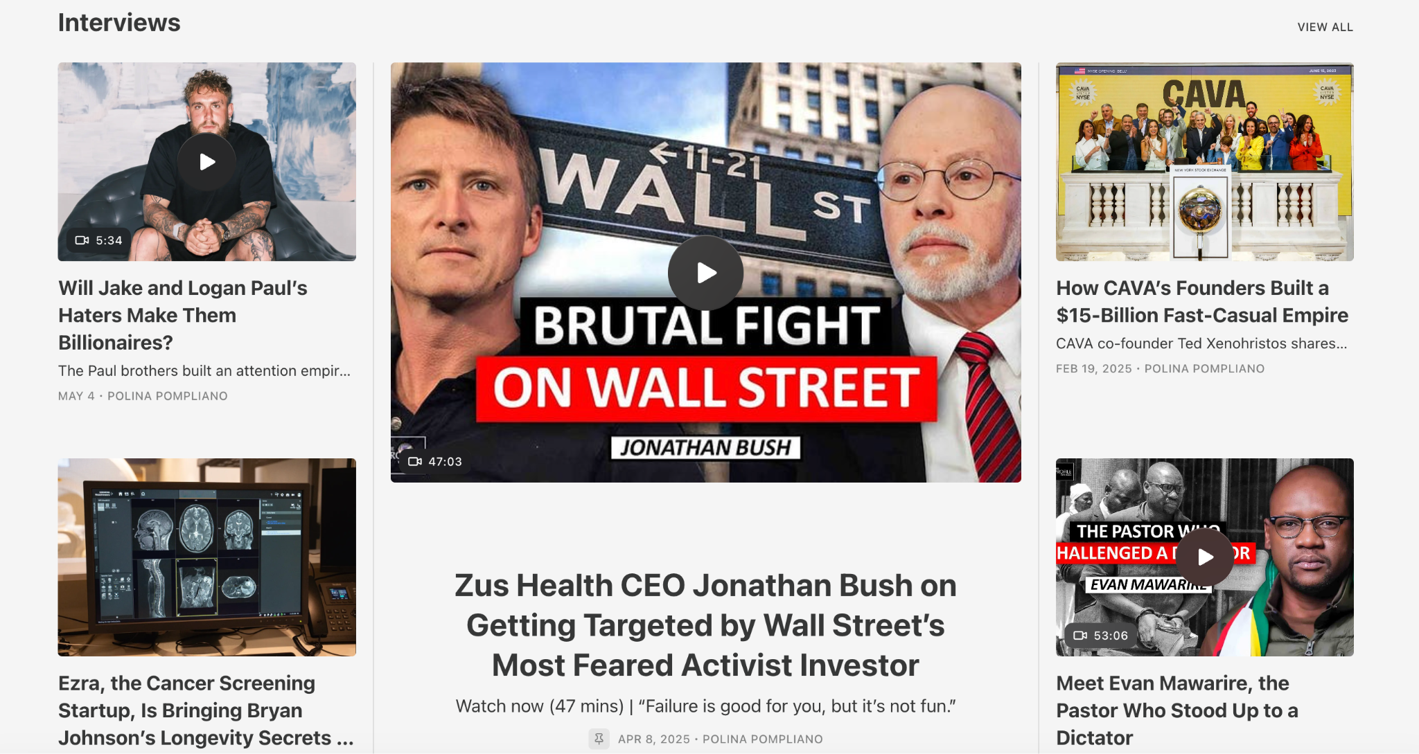
The Profile by Polina Pompliano looks like nothing else on this list. It looks like a real magazine in digital form. And it earns your subscription by showing you exactly what you’re getting before it asks.
The visual identity
White/light gray background. Clean, editorial. At the center top: “The Profile” in an elegant serif font, the kind you’d see on a print magazine. This is not an accident. Serif fonts carry associations with print media, long-form journalism, and editorial credibility. They say: we take words seriously here.
The logo in the top left is a small black silhouette of a face in profile. Minimal, memorable, and directly tied to what the newsletter is about: profiling extraordinary people.
The accent color is teal green, used on the Subscribe button. It’s unusual. Most newsletters use orange or dark blue. Teal is distinctive and stands out in a field of similar-looking publications.
The navigation bar: the most extensive of any creator here
Look at The Profile’s nav bar: Home, Notes, Original Profiles, Interviews, The Profile Dossier, Columns, Learning Guides, About.
Eight navigation items. Every single one represents a different type of content the publication produces. This is the most developed navigation architecture of any creator in this article.
What this navigation says to a visitor is: this is a serious operation with multiple content formats and enough volume in each category to justify its own dedicated page.
The hero: cinematic and full-bleed
The hero on The Profile is a full-width, full-bleed cinematic photograph of the subject being profiled, with white text overlaid: “Ryan Serhant Won’t Stop Until He’s No. 1.”
This is editorial design. The hero looks like the cover of a magazine, not the front page of a newsletter. The photograph is professional-grade, and the text overlay is bold and provocative. It makes you want to read the article before you’ve even decided whether to subscribe.
The subscribe strip: placed immediately below the hero
Right below the hero image, there’s a gray banner strip that says: “The world’s most extraordinary people in your inbox every Sunday.” with a teal Subscribe button next to it.
Notice what this strip does not say. It doesn’t say “Join X subscribers.” It doesn’t say “Free.” It doesn’t make a list of benefits. It makes one specific promise: extraordinary people, in your inbox, every Sunday. That’s it. Benefit-first, specific, and doesn’t oversell.
Placing this immediately below the hero is smart. A visitor who just saw that cinematic hero is at peak interest. The subscribe strip catches them at that exact moment, before they scroll away.
The content organization below the fold
Scroll down and The Profile organizes content into named sections: Interviews (with a SEE ALL link), each section showing a grid of cards. The photography across all the content cards is high quality and editorial. When every piece of content looks like it was made with care, the implied message is: there’s a lot of this, and it’s all this good.
STEAL THIS
Write your subscribe CTA as a single outcome promise. Not a list of features, not a count of subscribers. One sentence that says: “Here’s the one thing you’ll get from this newsletter.” Then put that sentence immediately below your hero section, in its own bar.
Invest in a few high-quality thumbnails for your top articles. You don’t need every thumbnail to look this polished, but the ones in your hero and Most Popular sections are worth the extra effort.
What Every One of These Homepages Has in Common
Look at what these five creators have done across five completely different visual identities, audience types, and content styles.
Every single one of them has made a decision about what category their publication belongs in, and then built a design that signals that category.
Lenny signals warm expertise.
Dan Koe signals premium philosophy.
Justin signals a polished personal brand.
Tim signals approachable authority.
The Profile signals serious editorial journalism.
Every single one of them has built a navigation bar that serves specific reader intents, not Substack defaults. The archive is gone on most of these pages. In its place: pages built for different types of readers with different reasons for being there.
Every single one of them has thought carefully about what goes in the hero position. Not just “my latest article goes there.” A deliberate decision: is the hero for retention (showing new content to existing readers) or conversion (showing something designed to turn a stranger into a subscriber)?
And every single one of them makes the subscribe action visible and easy to find without making it feel like pressure.
These aren’t coincidences. They’re the same three or four decisions made thoughtfully by people who take their publication seriously.
Your Action Plan
Navigation bar: disable Notes, Chat, Archive, and Leaderboard, set up your content bucket pages
Theme Editor: logo, wordmark, accent color, font, activate custom body layout
Subscribe block: add it below the header and write your three messages
One hour of setup for a homepage that works every day without you touching it again.
Your homepage is now converting visitors, the next step is making sure the first experience of being a subscriber is just as strong.
When someone hits subscribe, they receive a welcome mail, and that welcome mail is one of the most-read pieces you’ll ever send.
Vinayak and I already wrote the full guide on how to make it perfect, read it here.
A huge thank you to Vinayak for putting together the 5 decoded homepages.
Go subscribe to his newsletter
And ff you’re still in the early stages of building your Substack, the Substack Side-Hustle Sprint is the best place to start, it walks you through everything you need to get your newsletter up and running the right way.
Subscribe to Write Your Way To Wealth and get the Substack Side-Hustle Sprint for free.
See ya soon
Timo Mason🤠

Liked this post? 2 ways you can support me
Share it with a creator friend who will benefit.
Ask a question or share your thoughts in the comments.
 | A guest post by
|
This is valuable, saving this. Going to use this as a guide when I customise my Substack
I just updated my substack homepage for nurse in the market following Tim Denning's style that you guys mentioned here, thank you!!!
https://www.nurseinthemarket.com